
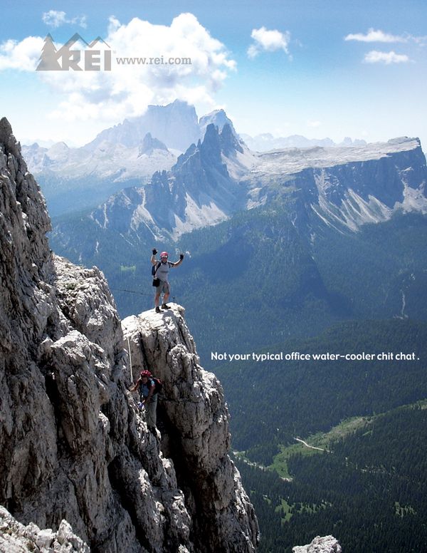
For this post, I will be doing a reverse-engineer of these two designs, which you can view above. The first (shown on the right) is the original design, by Kyle Caldabaugh. I found the image first from a google image search, and then later found he had done an entire ad campaign with similar ads. You can see his entire ad campaign at https://www.behance.net/gallery/422288/REI-Ad-Campaign
I created the second design, doing my best to imitate the original; in terms of design, colors, typography, layout, visuals, message, etc.
When looking for an ad to imitate and recreate for this project, this was one of the first ones which caught my eye, and I kept going back to it. It appealed to me because of the large image, with a unique message, and the color scheme. I also looked through photography that was available to be used, and found a few potential images which I thought might look good on an imitation of this design. And I am really glad that I chose to use this design, it gave me a lot of ideas to work with on the design.
Original Ad Analysis
For the analysis of the original ad, I will be considering the designers use of the principles of design, color, and typography.
Design – Alignment & Proximity
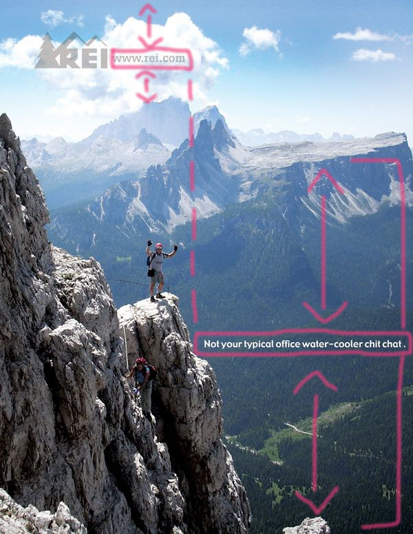
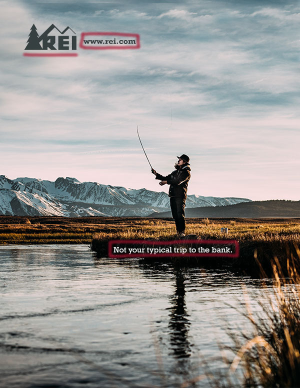
I had not realized the finer details of the alignment in this design, until I did this project. I am very impressed with how the designer chose to situate the two different groups of text on the image. First, the website URL is horizontally centered between the top of the mountain range, and the top of the page. Second, I really like how he chose to vertically “divide” the image in half using the right/left align options. If you look closely, (you can refer to my draw-over, above), the logo image is right aligned to the center of the page, and the text box is left aligned to the center as well. Third, the text box is situated horizontally in the center between the bottom of the page, and the top of the mountain range.
Design – Contrast & Repetition
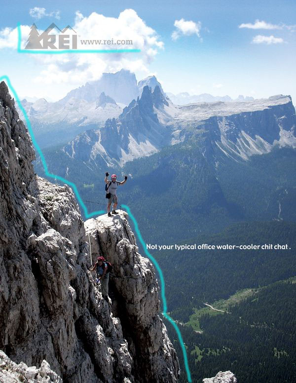
As far as contrast goes, I really like the contrast of the image of the design, and I love how the designer chose to contrast the logo with the mountain in the foreground. The REI logo includes the “mountains” and they corrospond to the edges of the mountain in the image. Additionally, he chose to use the color of the mountain as the color of the logo, and the logo is a little transparent, so the difference in colors there is similar to the shadow on the mountain.
Color Analysis
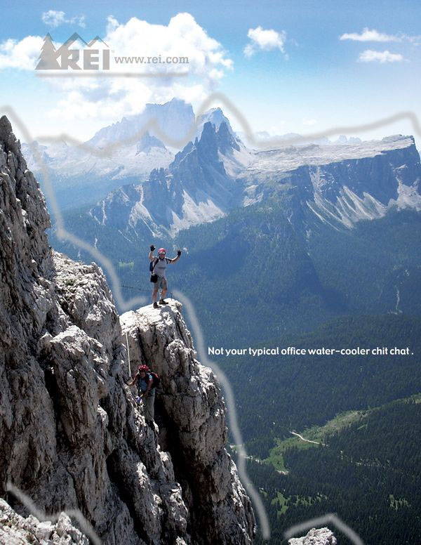
This design is very appealing to eyes because to the simple layout, and the beautiful colors of the photo. The main design choice as far as color, I already talked about in the previous paragraph. In this draw-over, I tried to draw more attention to this choice. You can tell that the tan color of the light parts of the mountains, match the color used in the logo. Additionally, I think it was a very good choice for the designer to make the logo slightly transparent, so that the clouds showing through match the darker color of the mountain in the foreground, where there is shade.
Typography Analysis
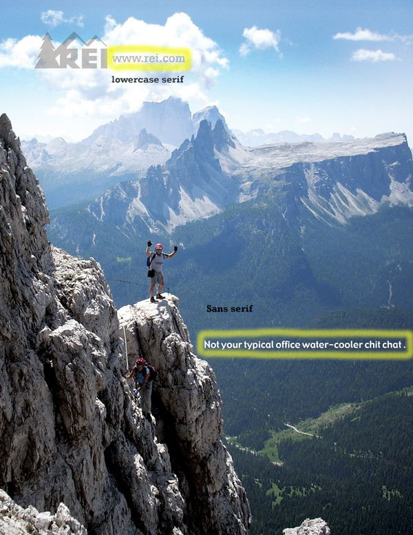
The type used in this design is fairly simple. The website URL text is a lowercase serif. (I imitated it with the font Rockwell in bold, and it looks quite similar. I think that it contrasts very nicely with the font used in the REI logo next to it. The second font used is a simple sans serif font.
New Ad Analysis

Design – Alignment & Proximity
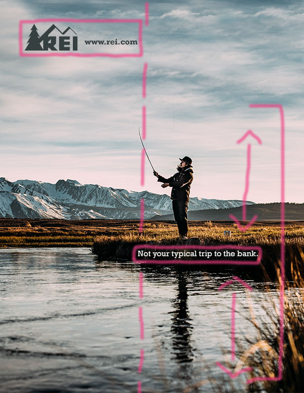
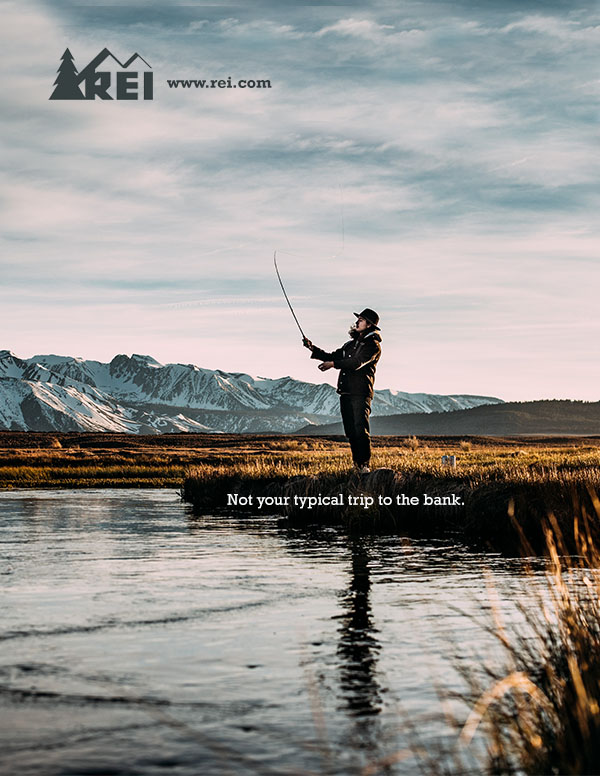
For my design, I tried my best to use similar choices with regard to the proximity and alignment on the advertisement. First, I tried to use a similar vertical division, with the logo and web URL right aligned to the center, and the text box left aligned the center as well. Second, the text box is horizontally in the center between the bottom of the page, and the top of the fishing line.
Design – Contrast & Repetition
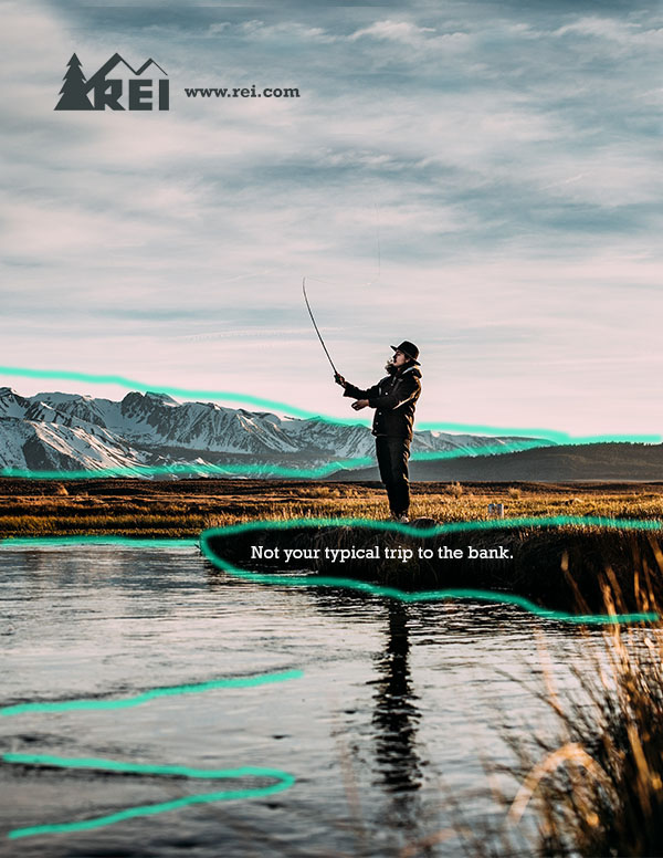
I did not make many decisions regarding contrast and repetition. The photo I selected to use already included lots of contrast. (Highlighted in the draw-over is several instances of contrast). I think that the fisherman in the center of the photo is another great example of contrast with the background. Repetition, the clouds in the sky have lots of repetition, in fact I repeated and pasted more than half of the sky that is shown, to change the photo from a landscape to a portrait layout.
Color Analysis
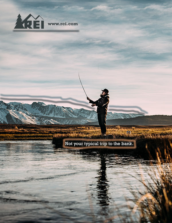
For my design, I did my best to not change the color scheme of the advertisement, but I did make a few changes to blend with the image I selected. For example, in the original design, the logo was a tan color, correlating to the color of the mountain range. Additionally, it was a little bit transparent to contrast with the shadowed areas on the same mountains. For my take on the design, first, I chose to change the color of the logo, to be a dark, moody blue that matches the color in the mountains of this image. I also tried to make the logo a little bit transparent, to mimic the original, but ended up keeping it completely solid, because I liked the look of that better. Second, I previously explained how I had to stamp and paste a lot of the top half of the image, due to the fact that it was a different orientation originally. As part of that stamping, I made the choice to use a lot of the blue color in the sky, matching another part in the mountain range. You can see I highlighted those two colors in the lines in the draw-over. The third color choice I made, was to place the text box on the river bank, in the darkest area, to highlight the contrast between the white text and the black background. Currently, the color of that text is a regular white, same as in the original ad. However, I did consider using an off-white, which would match the lightest part in the water; although, I ended up not doing this because it did not provide as much contrast.
Typography Analysis
As far as the typography decisions I made, they were pretty simple. The hardest part was finding fonts which matched the originals. For the logo font, I found the font Rockwell in bold looks very similar to the font used in the web URL. I had a harder time finding a font which I liked for the other text box. In the original they have a sans serif used, but after trying several sans serif fonts, I decided I preferred the look using the same font. I ended up using the Rockwell font, this time regular (not bold). I am happy with this decision because it is another way to add some contrast between these two fonts, in a simple way that does not detract the audience’s attention from the message.
Conclusion
This project has taught me a lot, and I am actually quite happy with the progress I made and the somewhat-final product. It was very fun to work on! My favorite part was working on alignment, changing the orientation of the image, and selecting colors. The hardest part was figuring out what font I should use. In the spirit of doing my best to imitate the original advertisement, I am still interested in finding the correct sans serif font, and seeing if it looks good on my design. Other than the font issue, I feel like the only other major changes I made to the design “idea” was in the color scheme, primarily that my design is a more “moody” and slightly darker scheme of colors. But that is actually one of my favorite parts!
