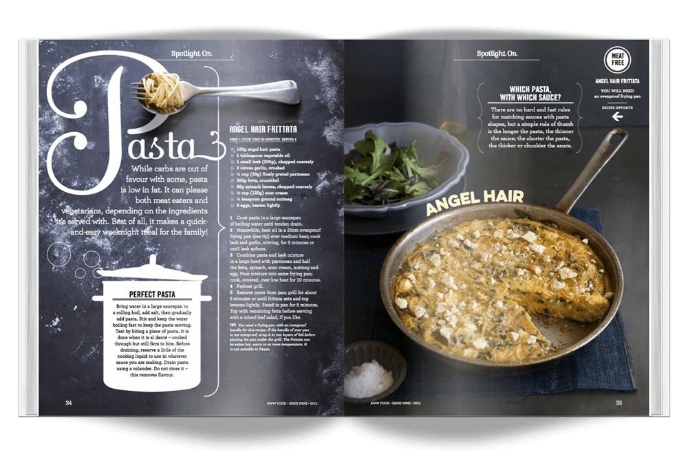

For this reverse engineer project, I will be analyzing this magazine spread, created by Hieu Nguyen, who is an art director, and designer, who is based in New York. You can visit his website to view more of his work at https://www.hieunguyendesign.com/
Typography – Category
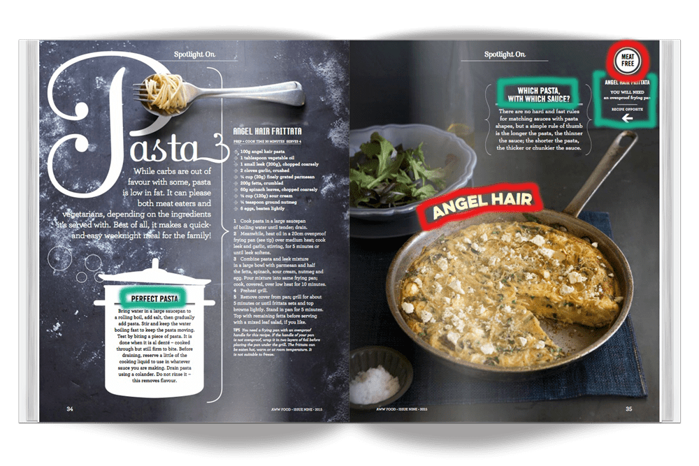
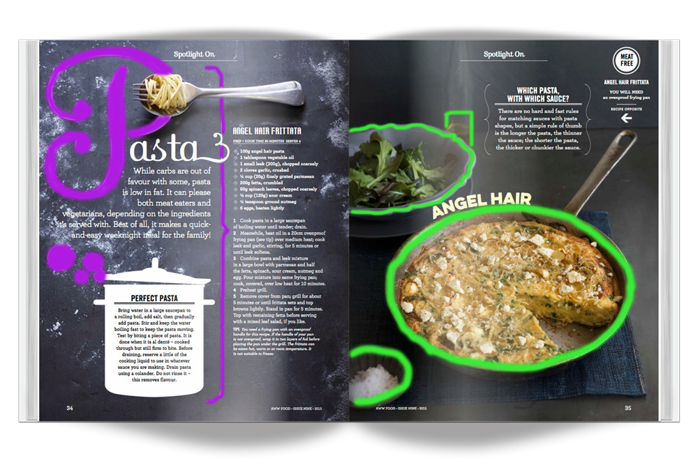
In this magazine spread, there were two categories of typography used. On the left image, highlights the sans serif typography. The right image highlights the slab serif typography in orange. Two different types of sans serif were used, a narrow bold highlighted in green, and a regular bold which is highlighted in red.
Typography – Contrast
There is tons of contrast to be found in this example, and I think that it is very effective!
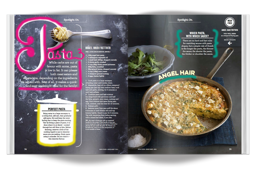
Starting out in the top left hand side, highlighted in pink we have the word “PASTA” which is accentuated, and it adds a lot of contrast to the rest of the regular font on the page. The creator of this image utilized this strategy amazingly, in that it draws your eyes right in, and is quite pleasing for your eyes to look at.
Second, is on the bottom of the left page, highlighted in yellow. Here we have the only text that is colored black on a white background, so they are using color as the method of contrast here. It was a great way to separate this part of the image from the recipe section. Additionally, I liked how there was some extra white space on this part for your eyes to rest on.
Third, is the section at the top right, highlighted in turquois. Here we have the two different categories of typography contrasting each other. The heading part is using the narrow sans serif, and the paragraph section is slab serif.
Lastly, there is the highlighted (turquois) “Angel Hair” caption curved around the edge of the frying pan. This part of the image is interesting because it uses a couple different methods of contrasting. It contrasts structure, in that it is one of the only places in the spread which uses the regular, bold sans serif. On my screen, it appears that the color of the wording is a more creamy color, unlike the rest of the text which is majorly white. So, if it is indeed cream, then it contrasts using color. I also really like how the text is shaped to form around the edge of the circular pan, which contrasts against the rest of the text which is all very straight. This also does a great job of drawing your eyes into the pan!
Photography
I absolutely love how the photography work has been done for this spread.
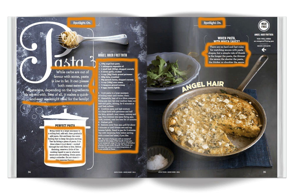
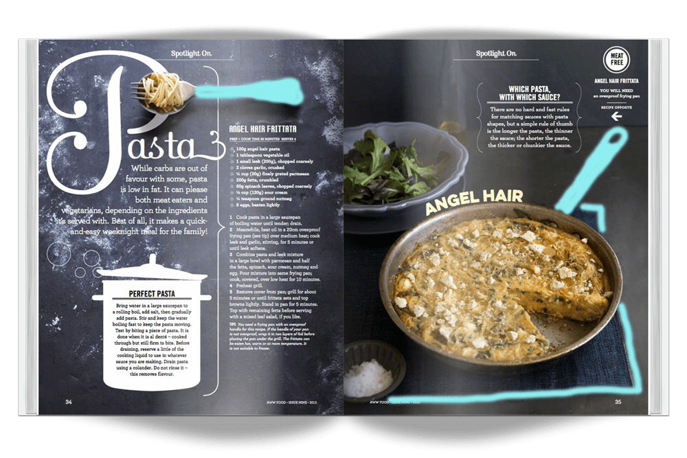
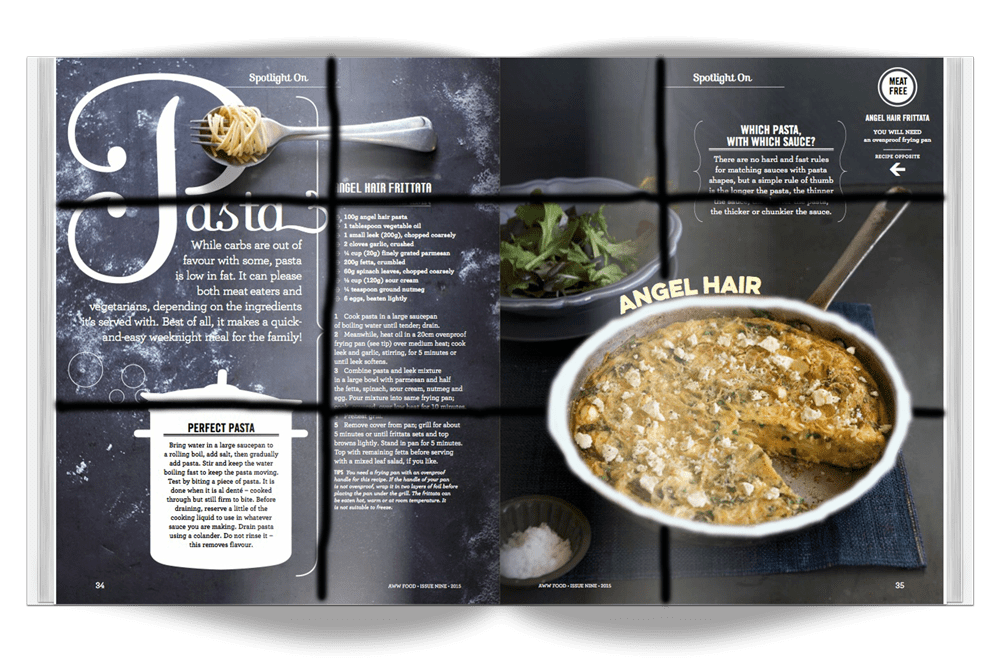
Depth of Field: In the left image, I have highlighted some of the features which I think enhance the depth you can see in the images! First of all, I love how the typography and background are made to look like they are pushed farther to the back, as if they are the actual cutting board which the fork is sitting on. The “flour” is a particularly great feature which makes it look even more authentic. On the right side of the image I have highlighted how there are actually four dishes, which adds a lot to the depth of field.
Leading Lines: In the middle image I have highlighted a couple of lines on the image which draw your eyes to the focus of the spread. On the left page, the handle on the fork acts as a line, which draws your eyes to the pasta. On the right, we also have the handle of the the frying pan, which draws your eyes straight to the food in the pan, as well as the lines which are on the edges of the placemat, which also draw your eyes into the center of the image (the food in the pan again!).
Rule of Thirds: I used the entirety of both pages to draw the thirds, and that results with the frying pan of food being right in the bottom right target area. This is another excellent way which the photographer and designers are trying to draw your eyes to the focus of the spread.
3 Original Photos
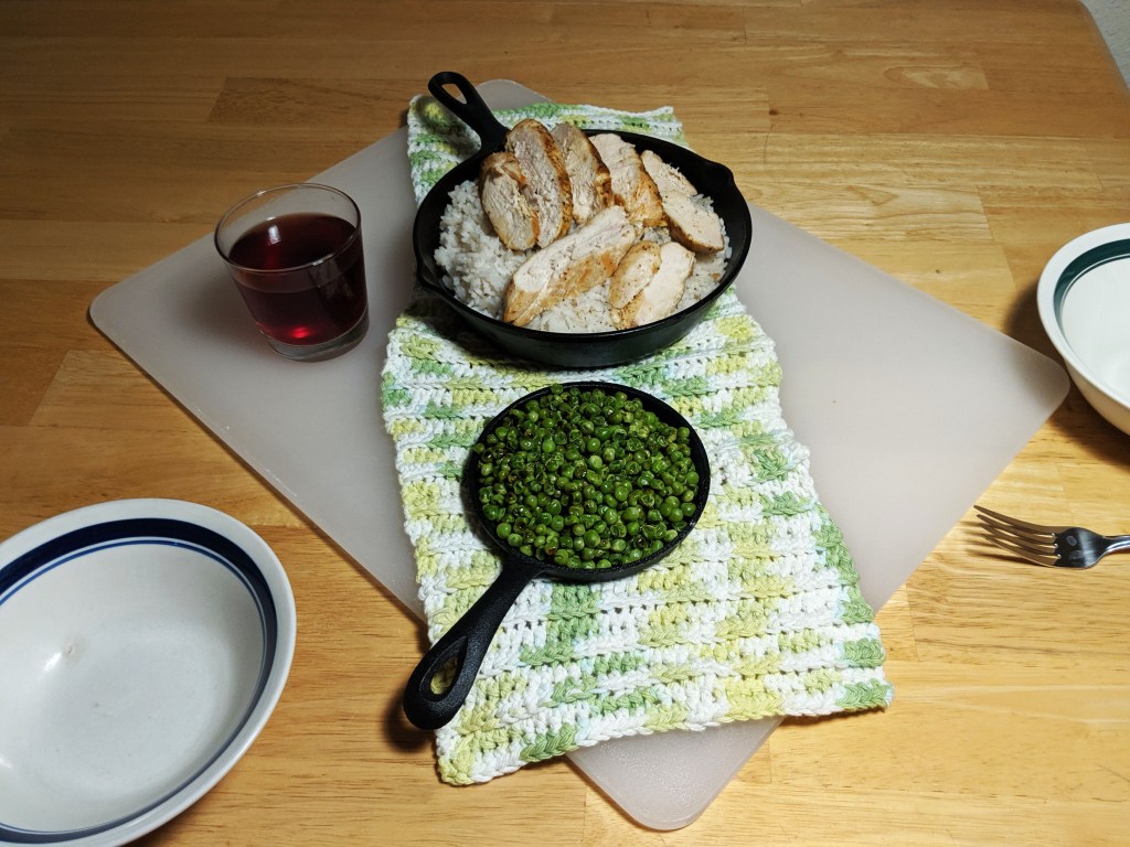
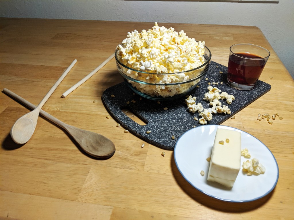
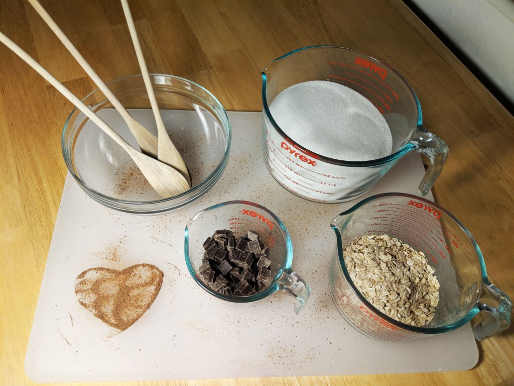
For my recreation of the photos, I figured the simplest way would be to just do food again! I tried to really hard to also use the leading lines principle to draw focus to particular aspects. I also tried to add some depth by having different items. Last of all, I did try to use the same rule of thirds in a similar way, but only managed to (kind of) with the second and third images, due to my beginner set-up.
Conclusion
This project has taught me a lot about how typography is contrasted in a way that is visually appealing, and about how the seemingly minor aspects of a photo are vital to the look being achieved. I also definitely have a newfound respect for food bloggers and photographers! I have always loved cooking and making my food presentation look nice, I have even read a couple of books about the art of presenting the food in a visually appealing way. But when it was going to be photographed, so much more thought had to go into it, from the dishes to the background to the lighting, and I definitely do not think it turned out how I hoped. It is hard to get it to look great on camera! But I definitely learned a lot!
