
In this post I am going to be analyzing this advertisement from the Milk Jar Candle Company. You can check their website out at https://www.milkjar.ca/
REPITION / COLOR
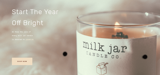
I really liked the correlation used in this design, particularly how the color on the shaded part of the label, matches the darker part of the background. I think it helps the company name on the label stand out, as well as the text on the background, even though they are similar in color.
Additionally, I liked that they didn’t use the same exact shade, but were consistent in using a warm yellow/pink color. You can see that in the bright color of the flame, the darker color of the melted wax, and then in the pale color in the “Shop Now” button.
CONTRAST
While I do really like how the product is front and center in this design, in order to make this easier on some eyes to read, I would have considered making the background darker so that the white text was easier to read without straining.
ALIGNMENT
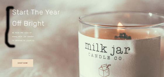
The creator of the design used an alignment to the left which really drew your eyes into the main item in the picture, the product.
PROXIMITY
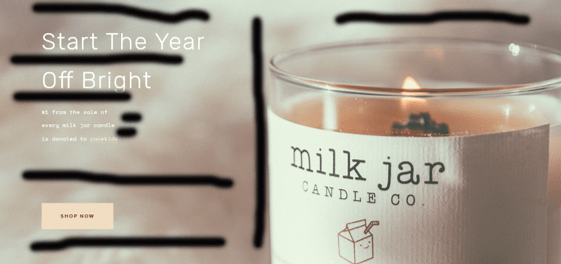
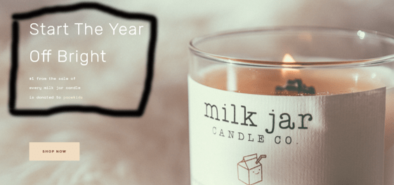
Shown in this edited image, they did a fantastic job leaving plenty of open space for your eyes to rest on. As I mentioned in the previous paragraph, the left alignment draws your eyes to the middle, where there is space for your eyes to rest, and then ultimately to the product they are marketing. They also used double spacing which was consistent with the size of the lettering.
CONCLUSION
I think that this was a fantastic design, and I believe it gets their message across perfectly. I enjoyed how the design “quietly” spread the message about the charity being supported, while still keeping the product front and center.
